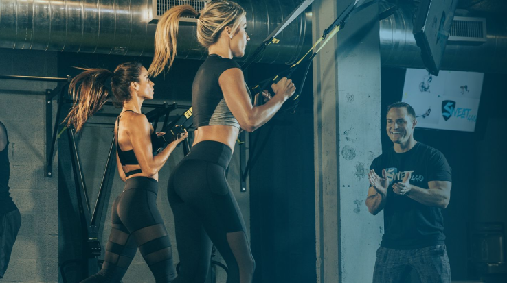
SWEAT440 needed a redesigned workout experience that would guide users through timed exercises with clarity, and an internal admin console to control videos, intervals, and workout sequencing. I redesigned both interfaces to improve usability, reduce trainer setup errors, and create a consistent, studio-ready workout flow.
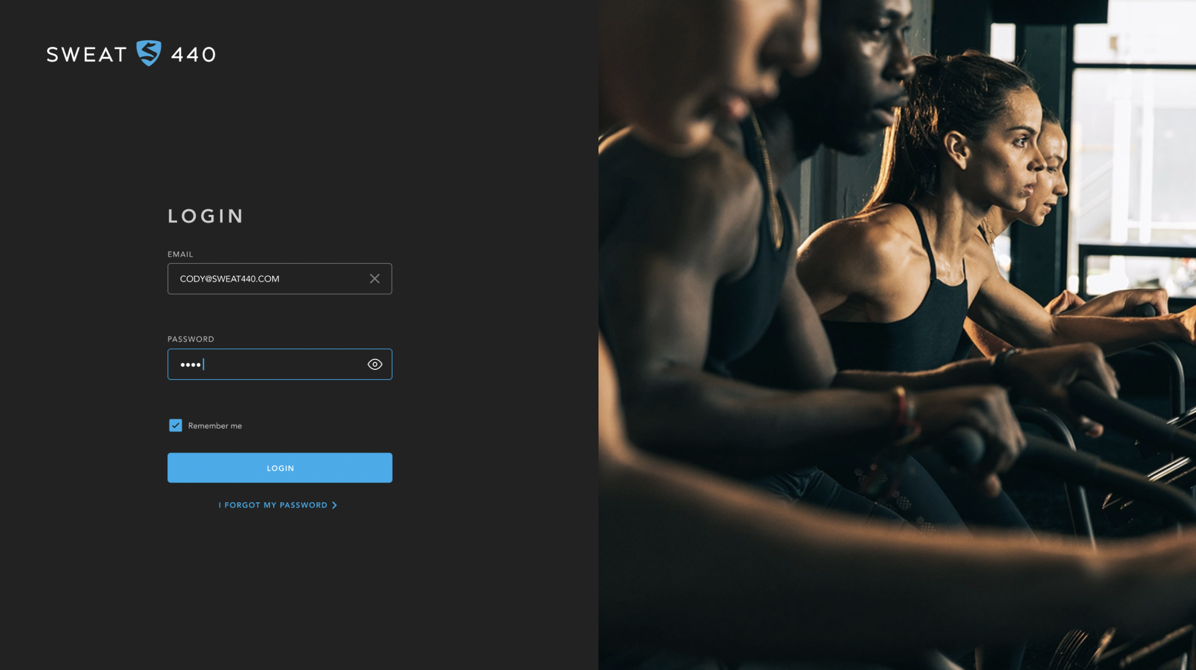
Redesign the branding the TV screens interface and design an admin portal to create and edit trainning sessions.
Problem
The existing workout screen and admin configuration console had major issues:
For users (athletes):
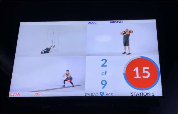
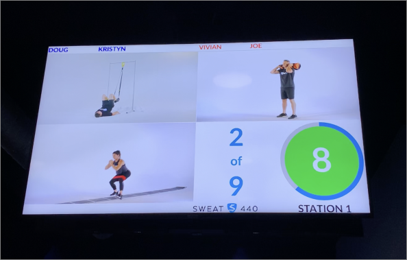
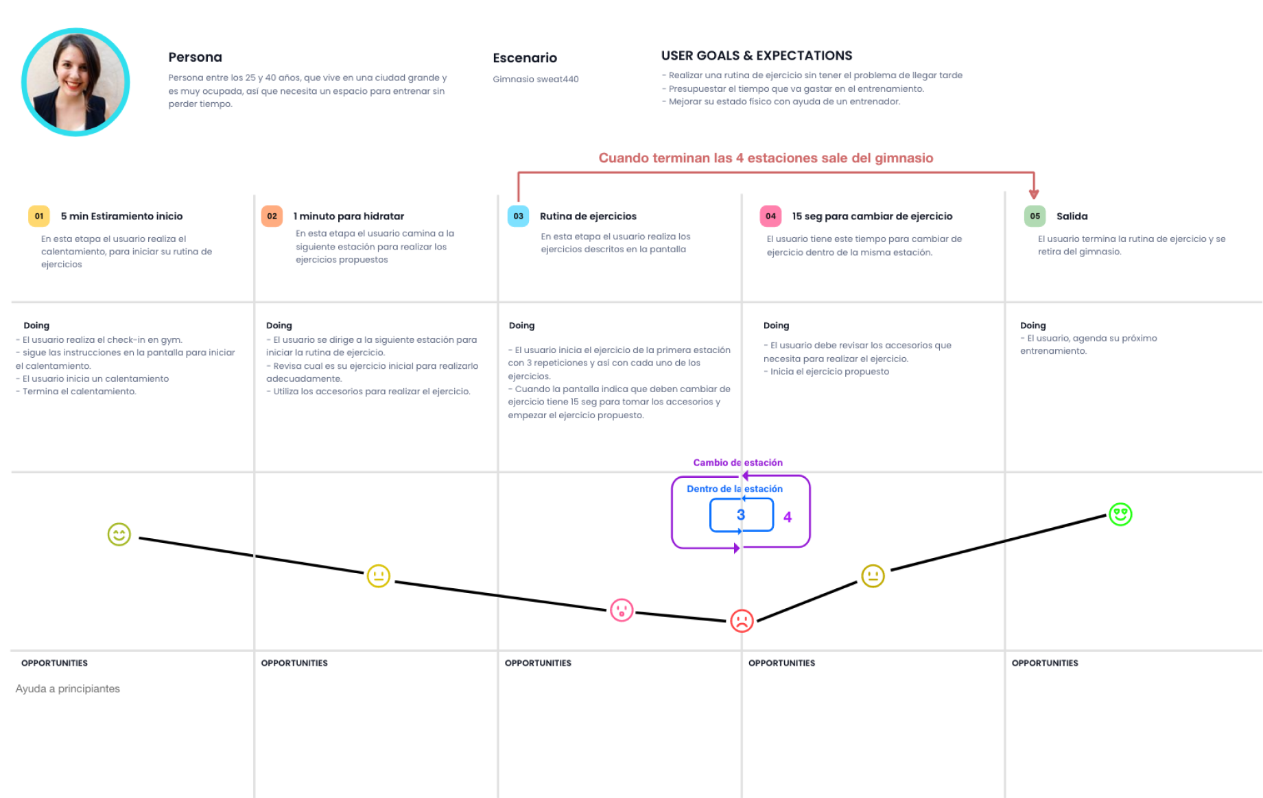
The workout guidance screen was cluttered, text-heavy, and difficult to follow in real time.
Users struggled to understand which exercise came next, how much time remained, and what intensity to maintain.
The pacing indicators were inconsistent, confusing rapid-fire intervals.
For trainers (admins):
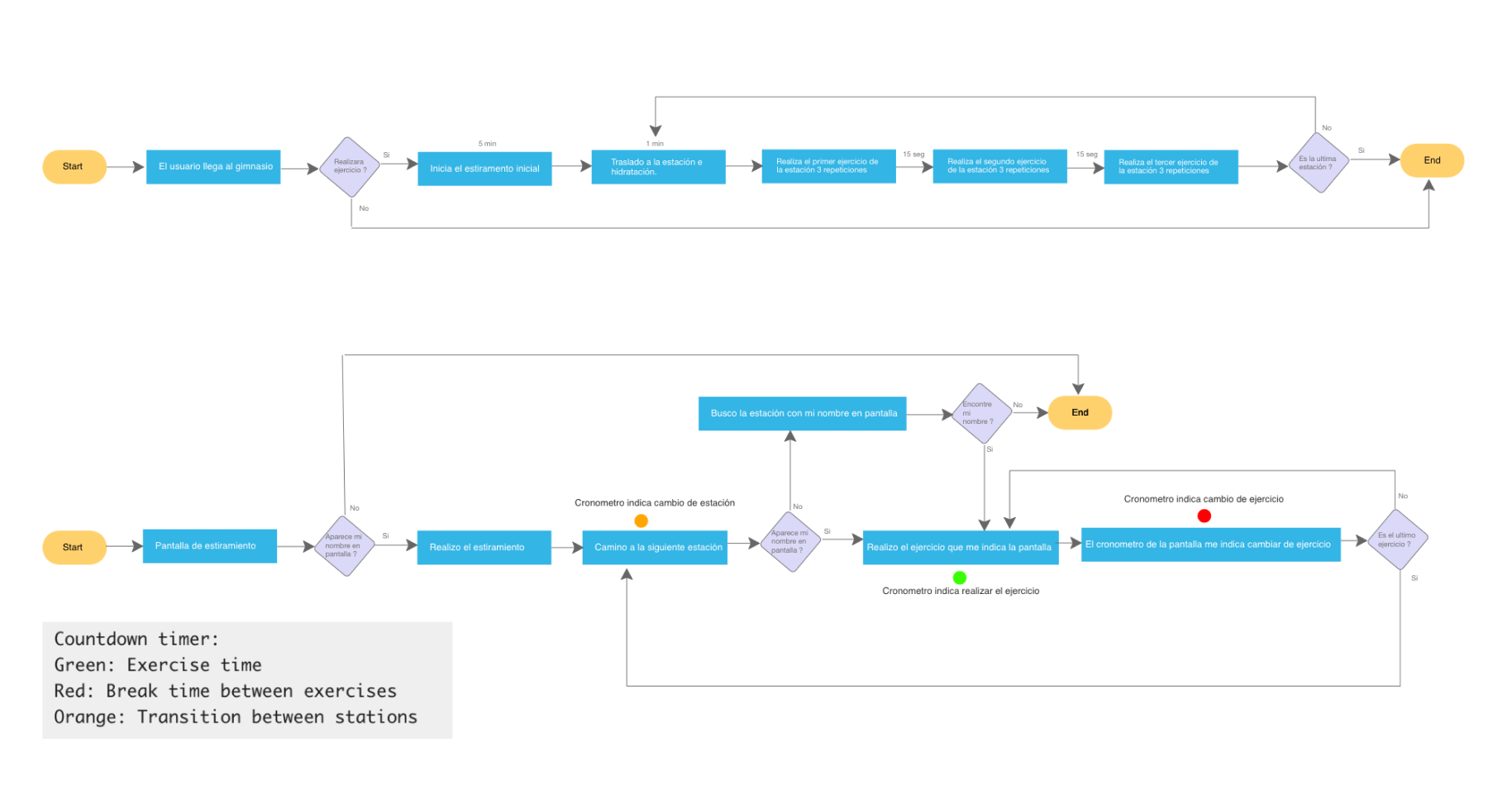
The console used to configure videos, timing, and exercise sequences was unintuitive.
Updating workouts required too many steps and provided no visual preview.
Inconsistent flows caused delays before each class.
This created friction for athletes, operational inefficiencies for staff, and inconsistent studio experiences.
Older Workout Screen
Action
I redesigned the full user-facing workout screen and internal console using an evidence-based UX process:
I redesigned the full user-facing workout screen and internal console using an evidence-based UX process:
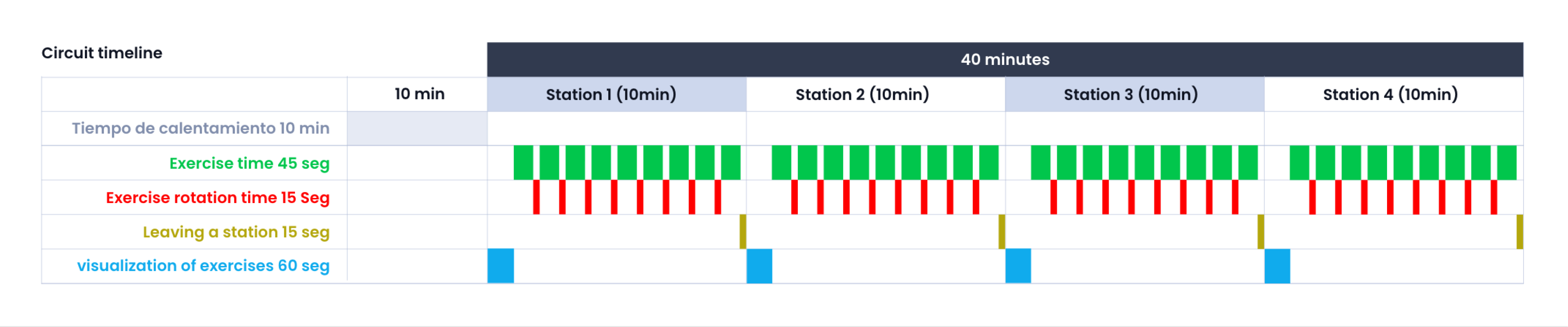
1. Mapped the entire workout flow
Documented each interval type, rest period, video requirement, and trainer workflow. Identified tasks with the highest error rates.
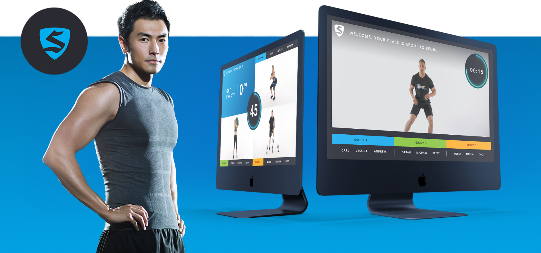
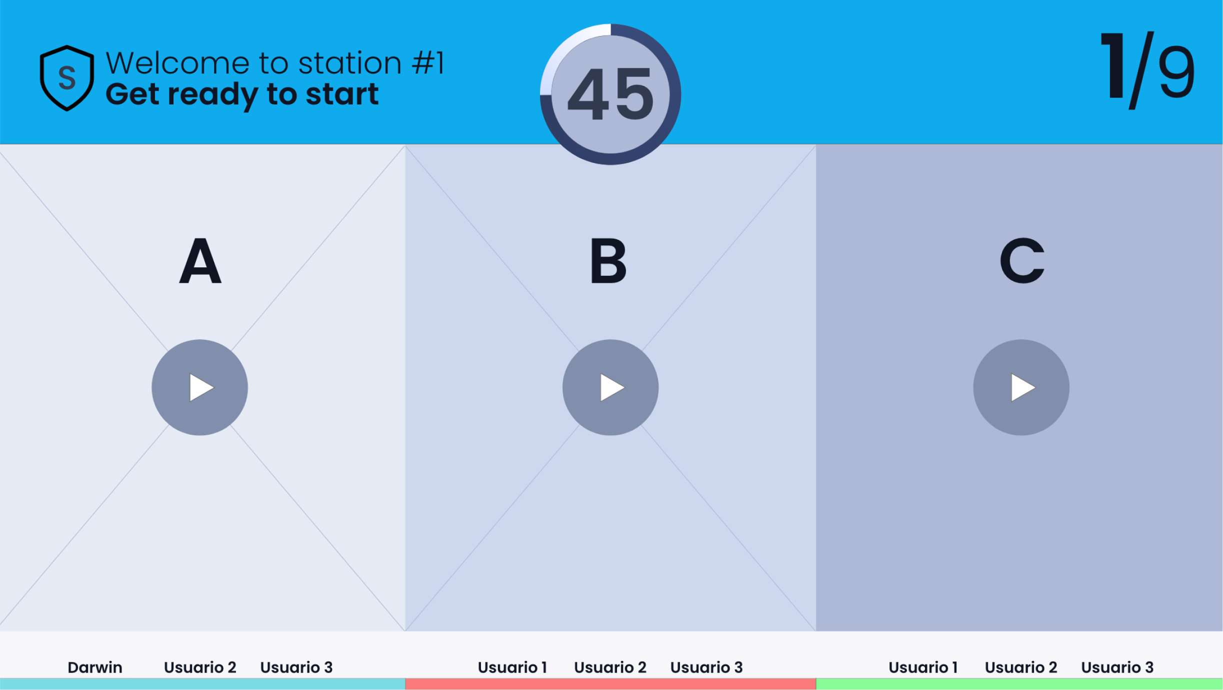
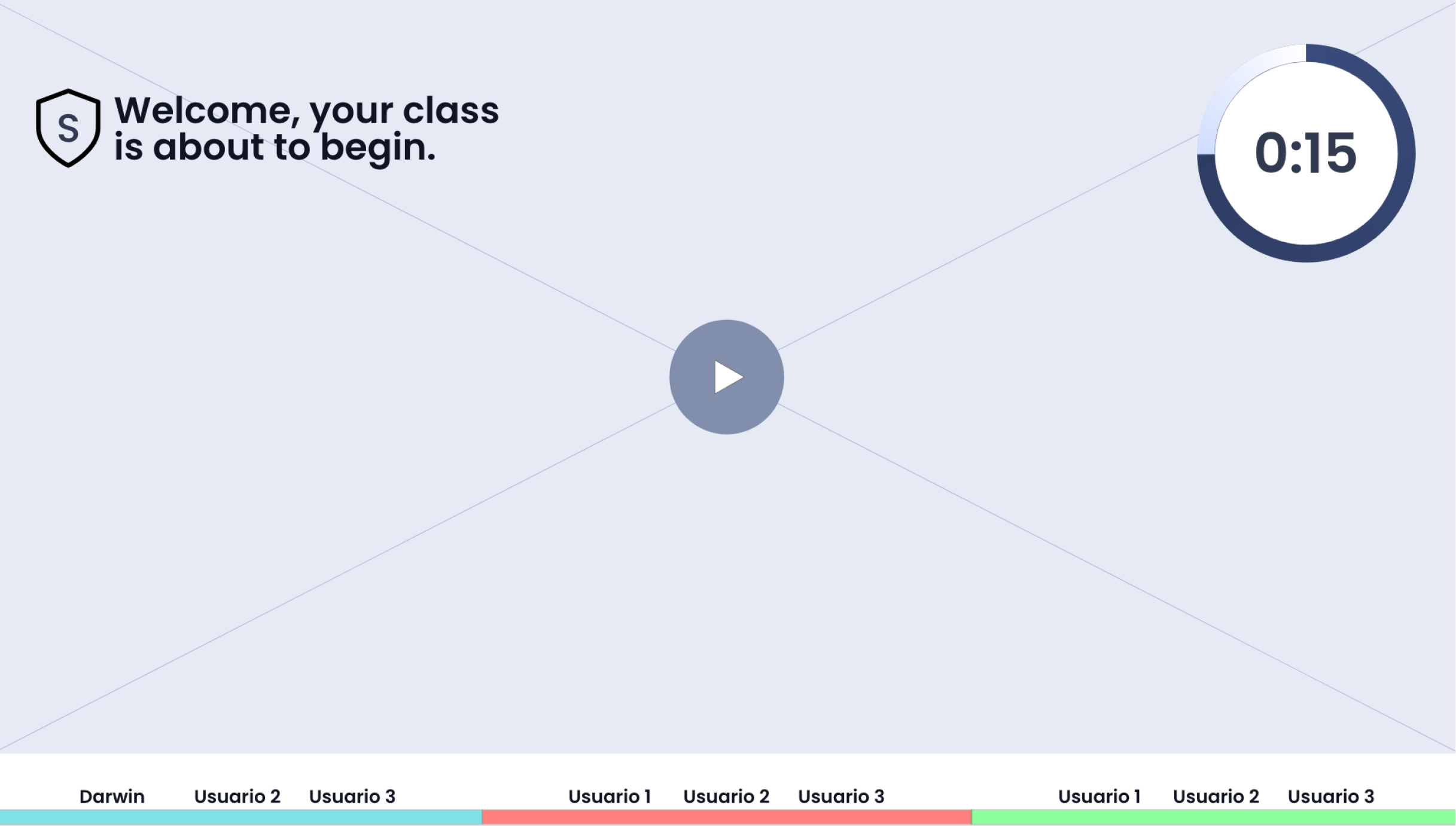
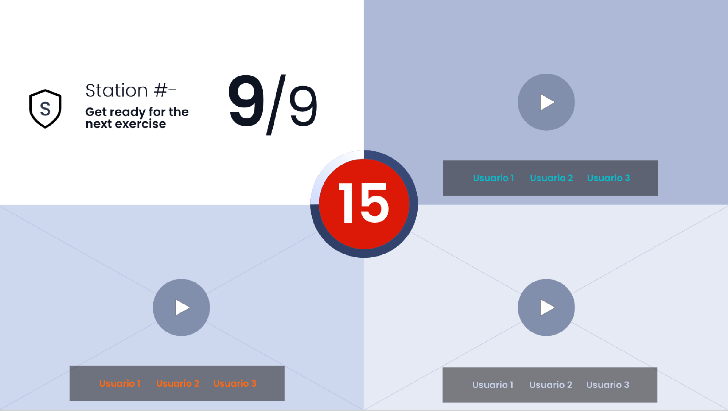
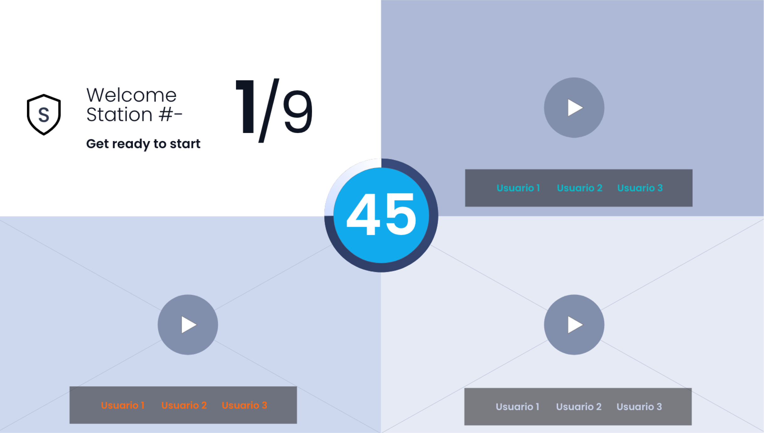
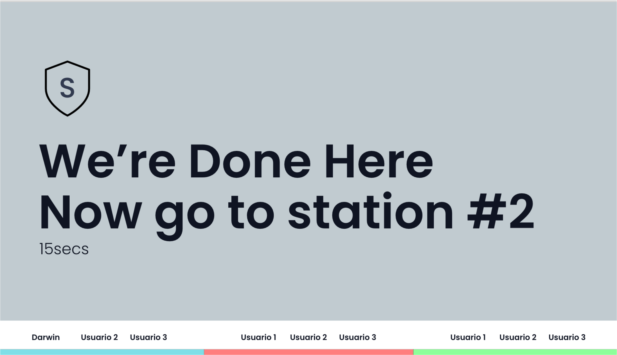
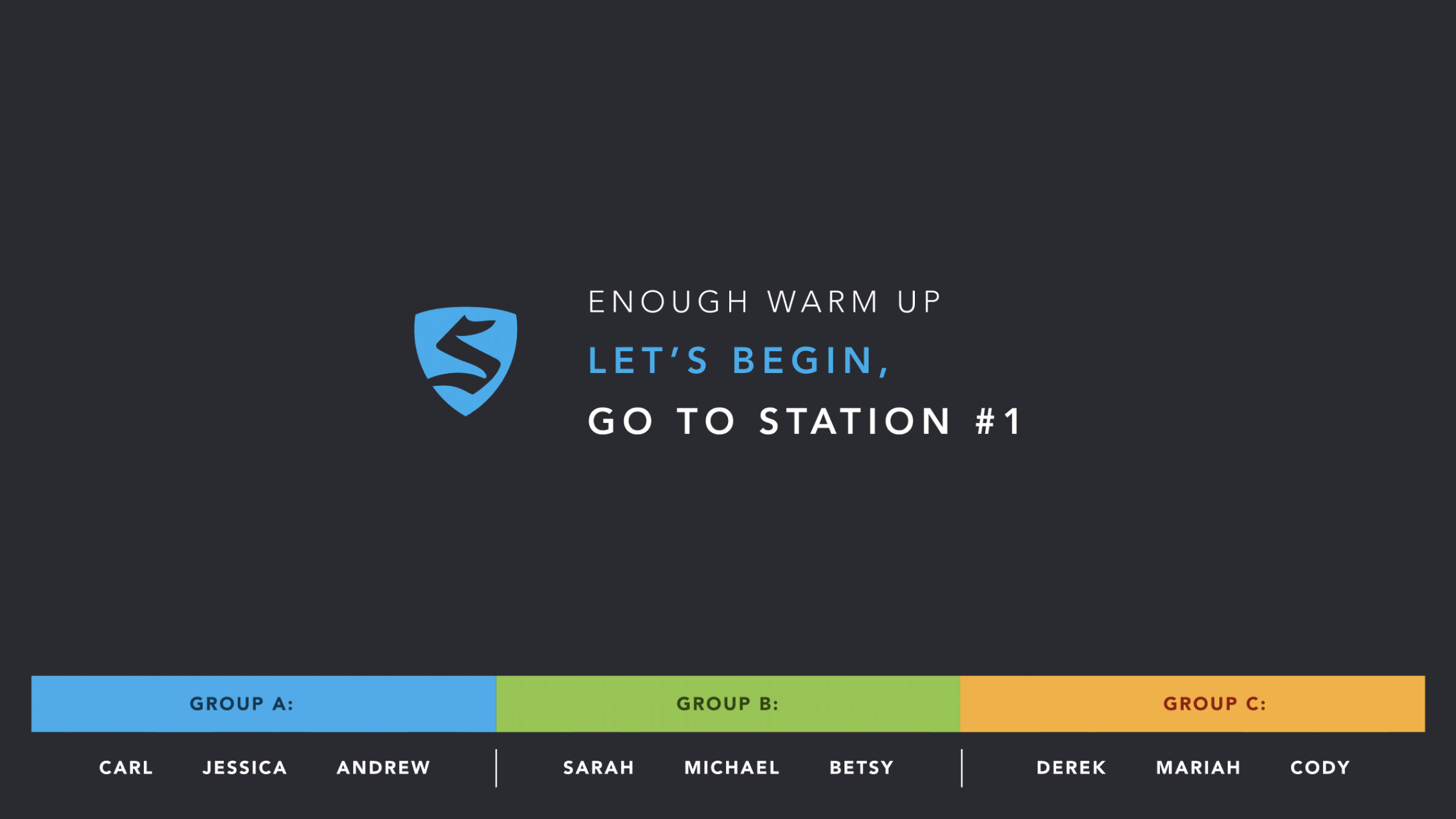
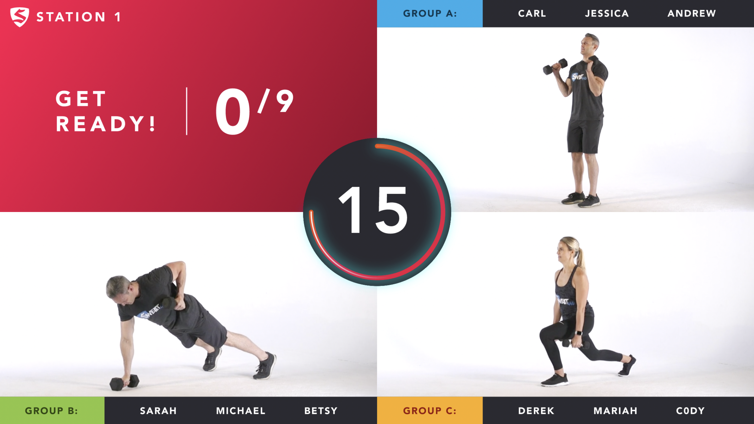
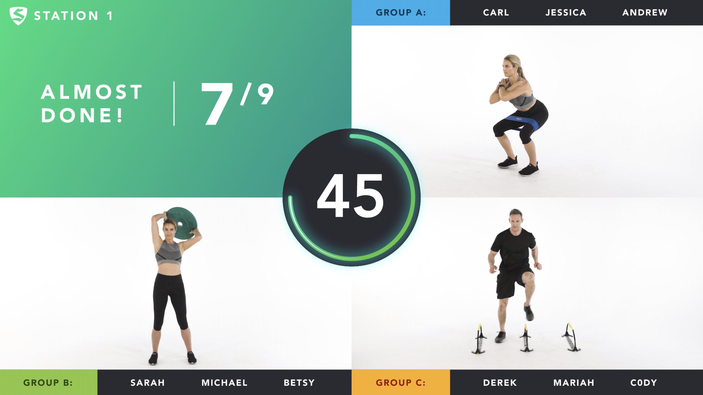
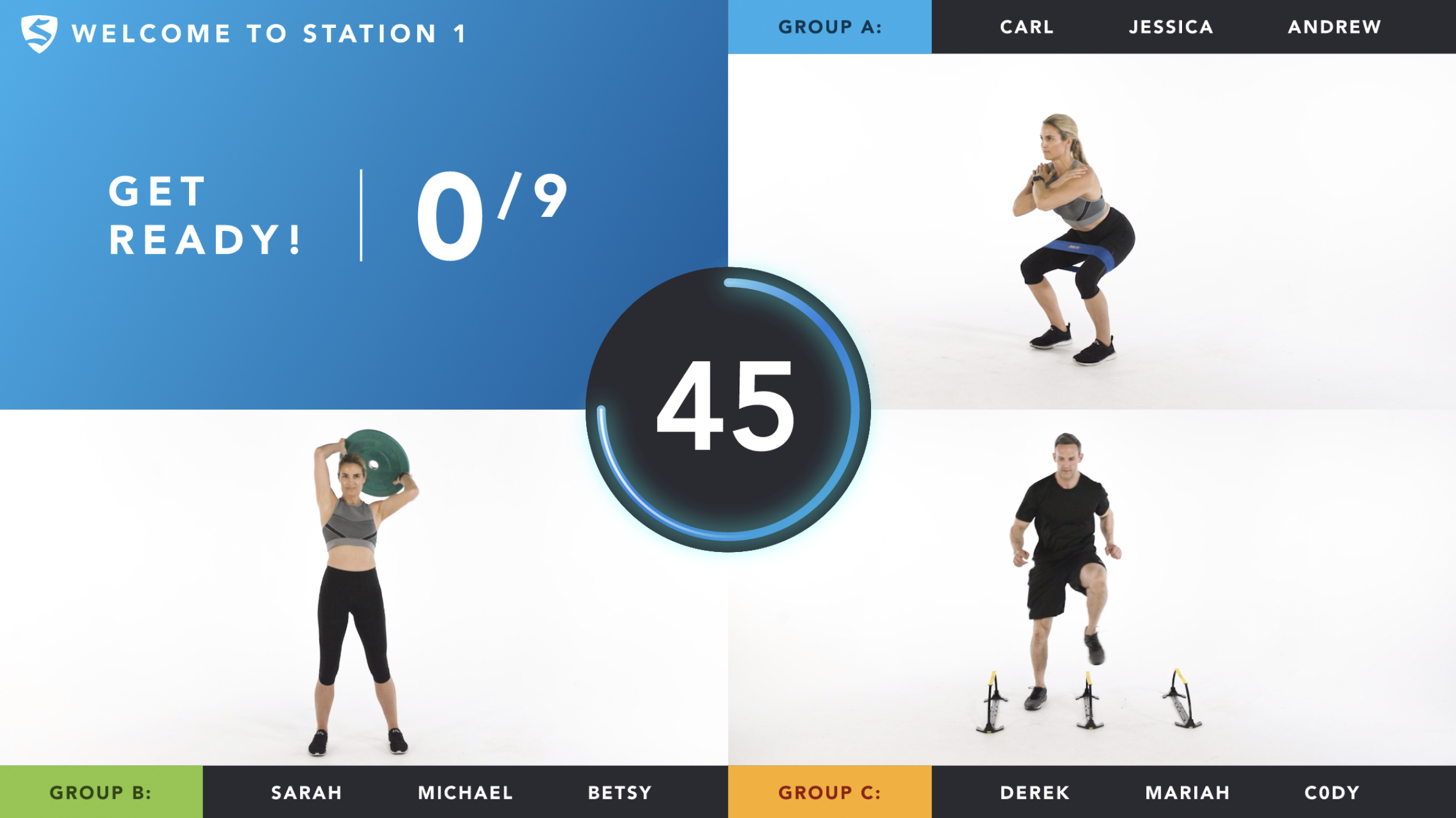
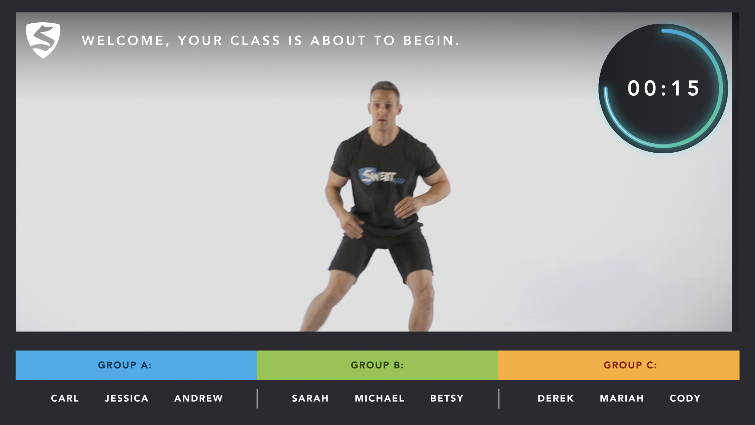
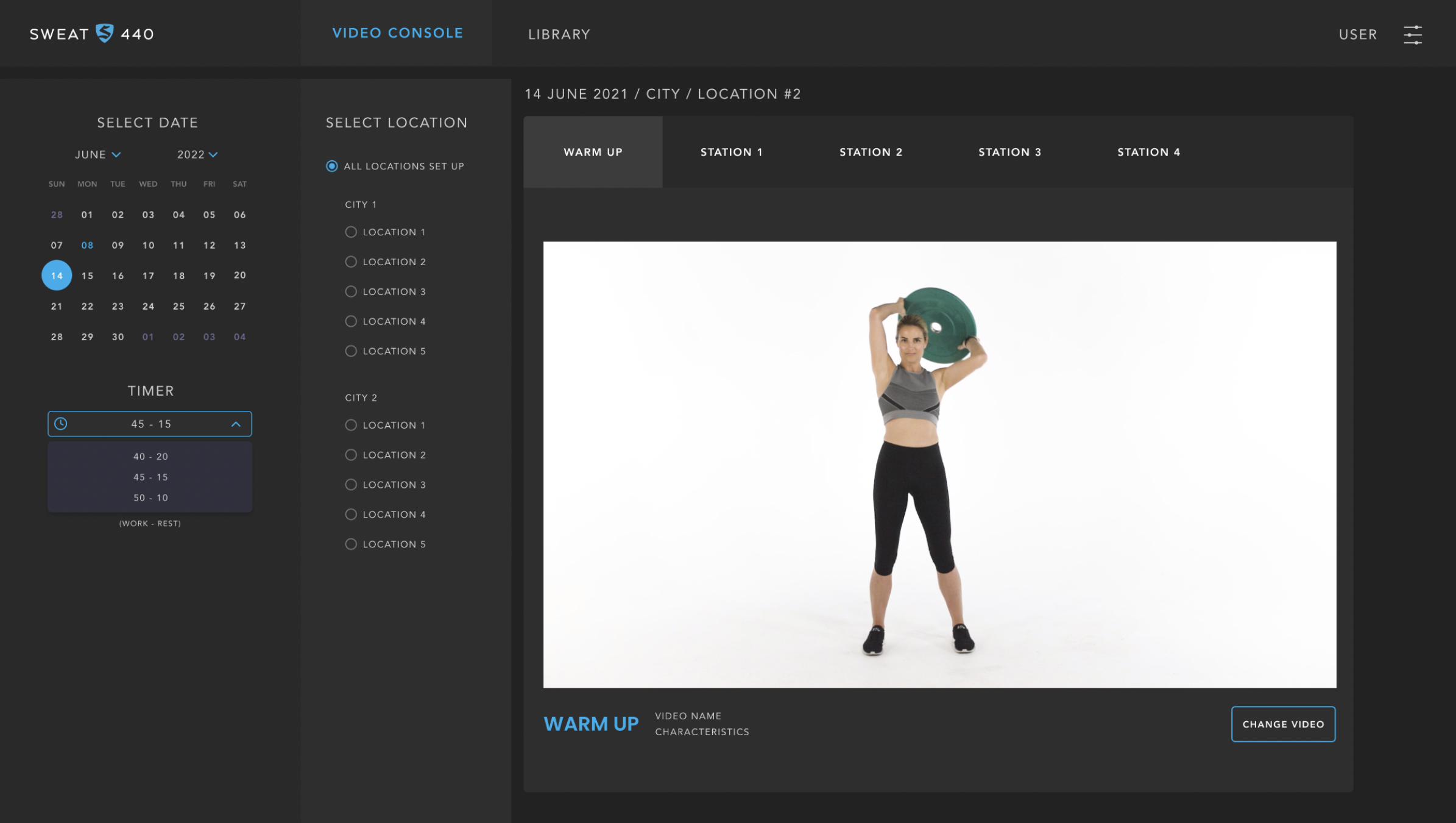
2. Redesigned the workout guidance screen
Delivered a new UI that included:
Large, clear exercise video window
Bold countdown timers
Clear labels for current + upcoming exercises
Stage indicators
Color-coded intensity markers
Non-distracting animation cues for transitions
Simplified layout optimized for distance viewing (gym screens)
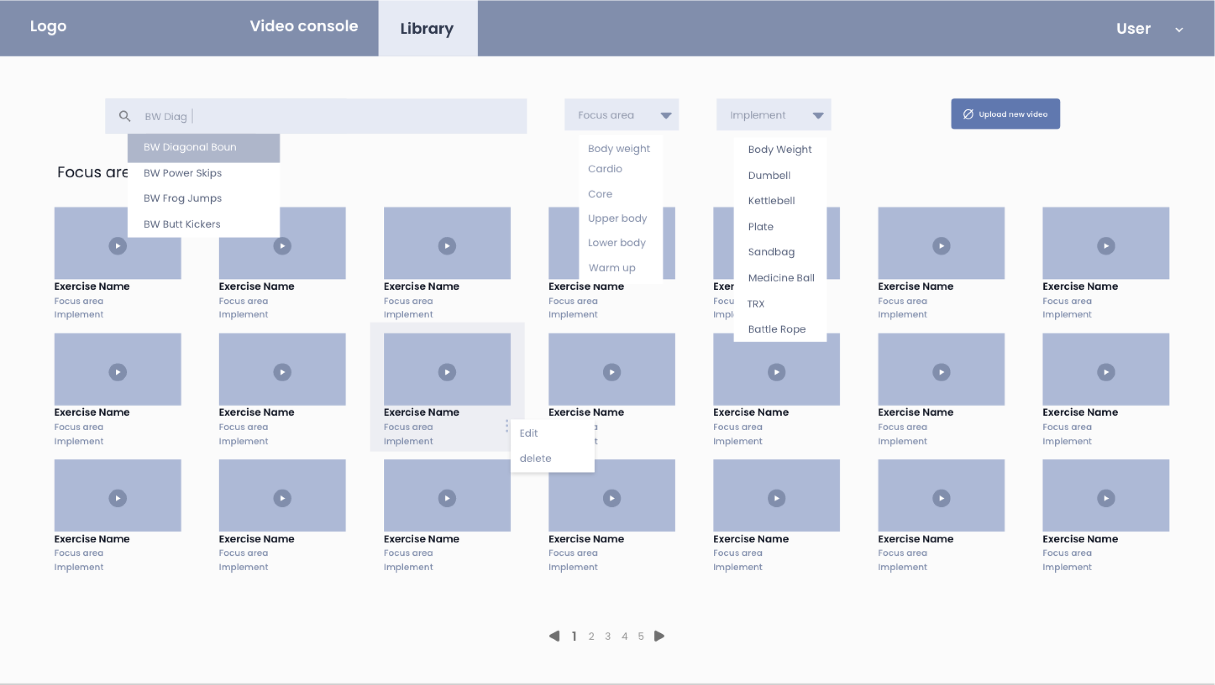
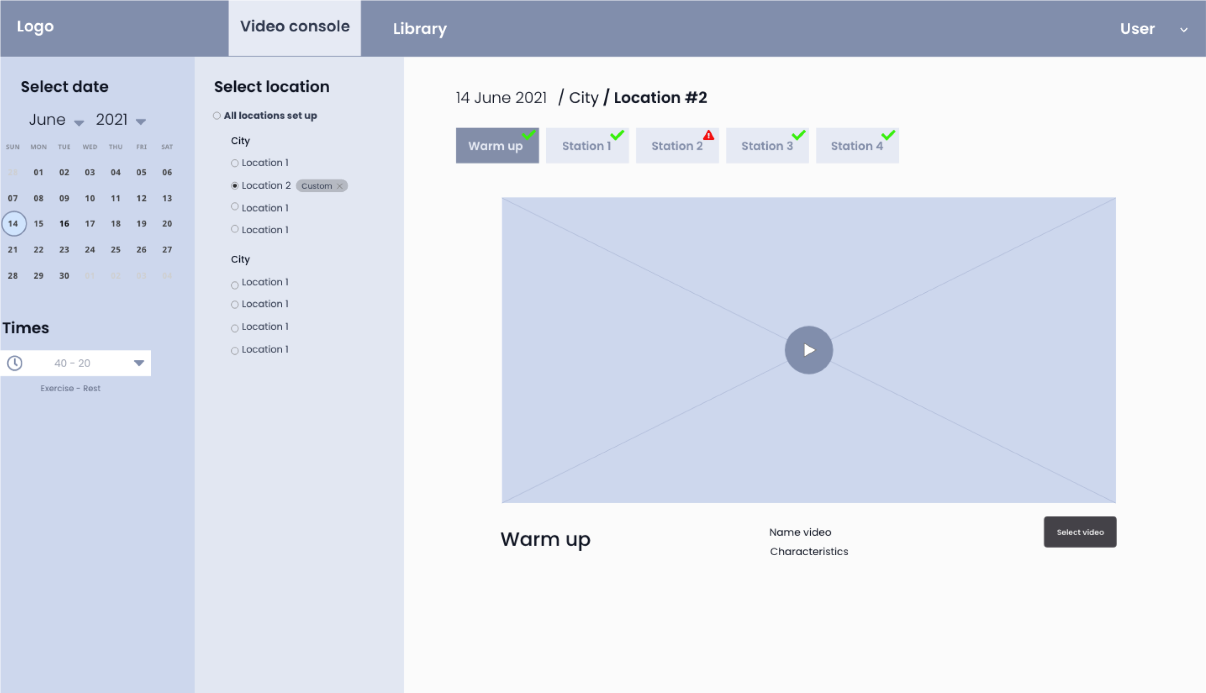
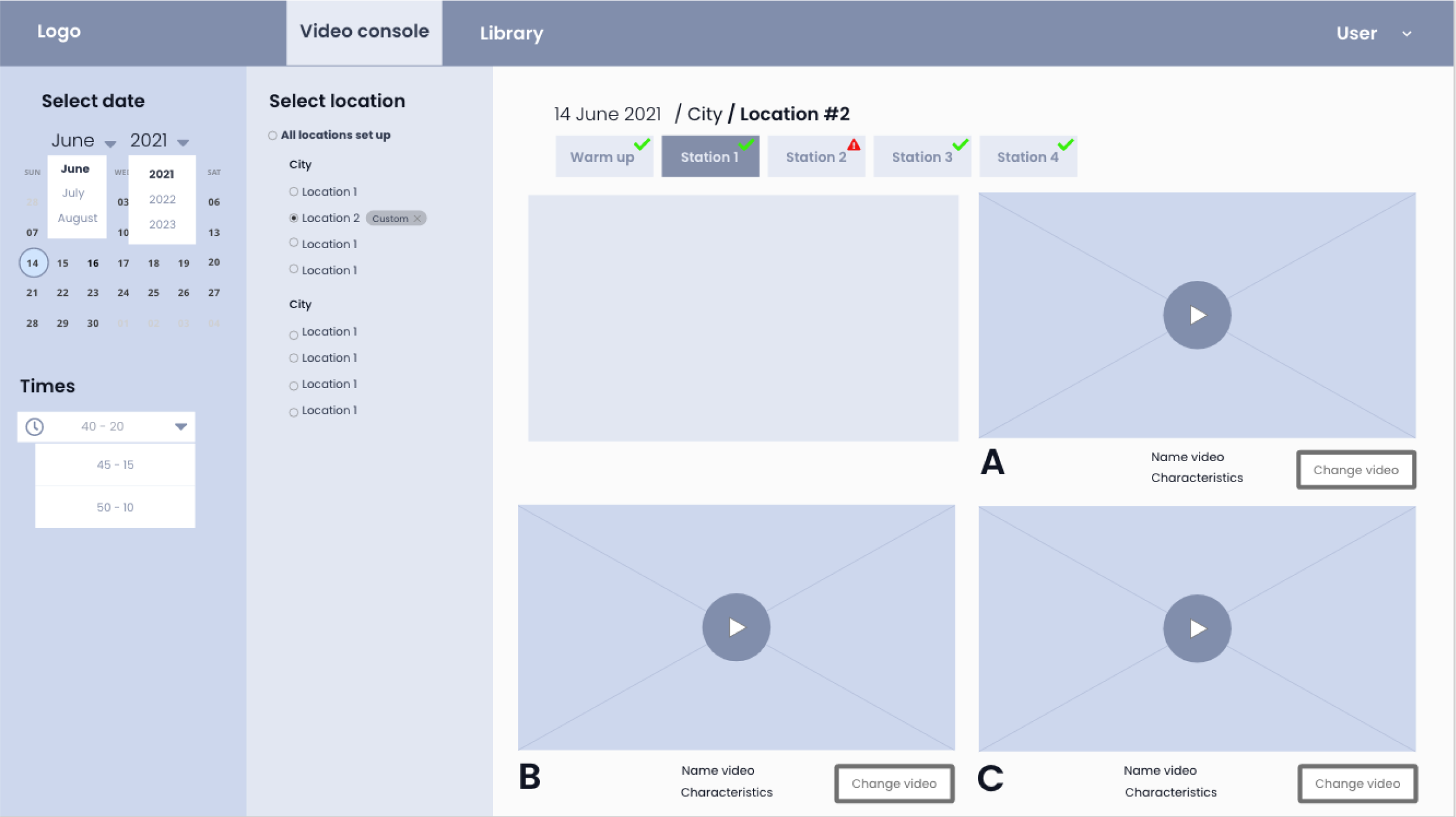
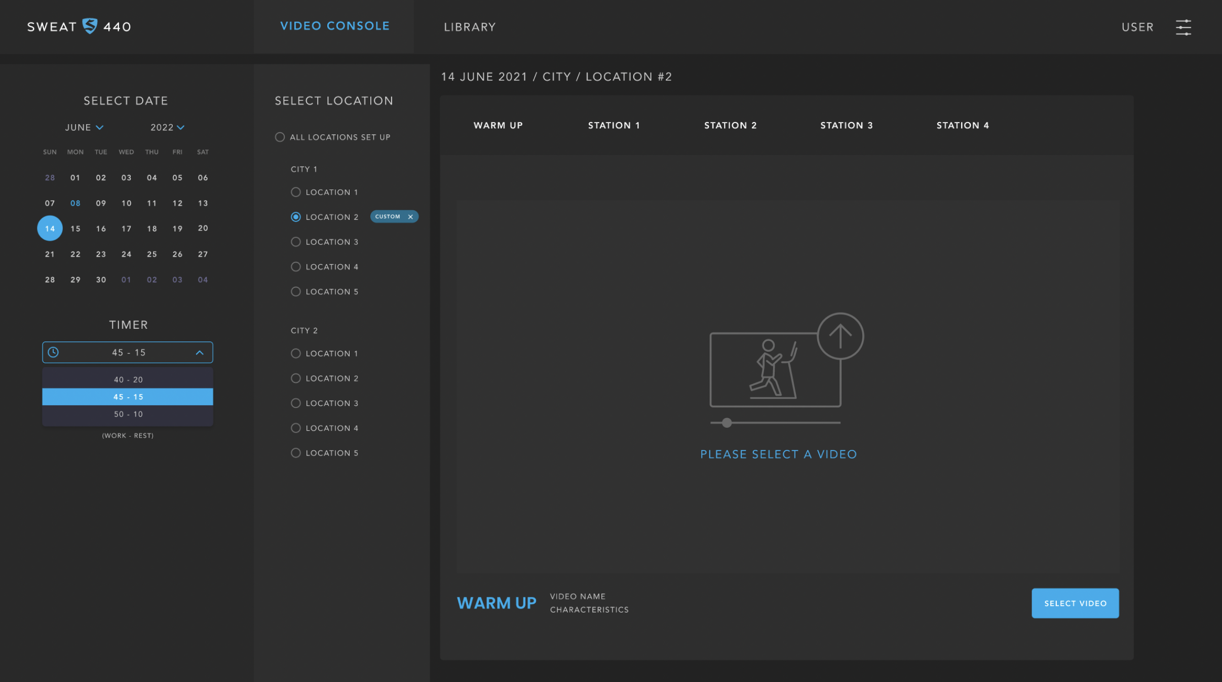
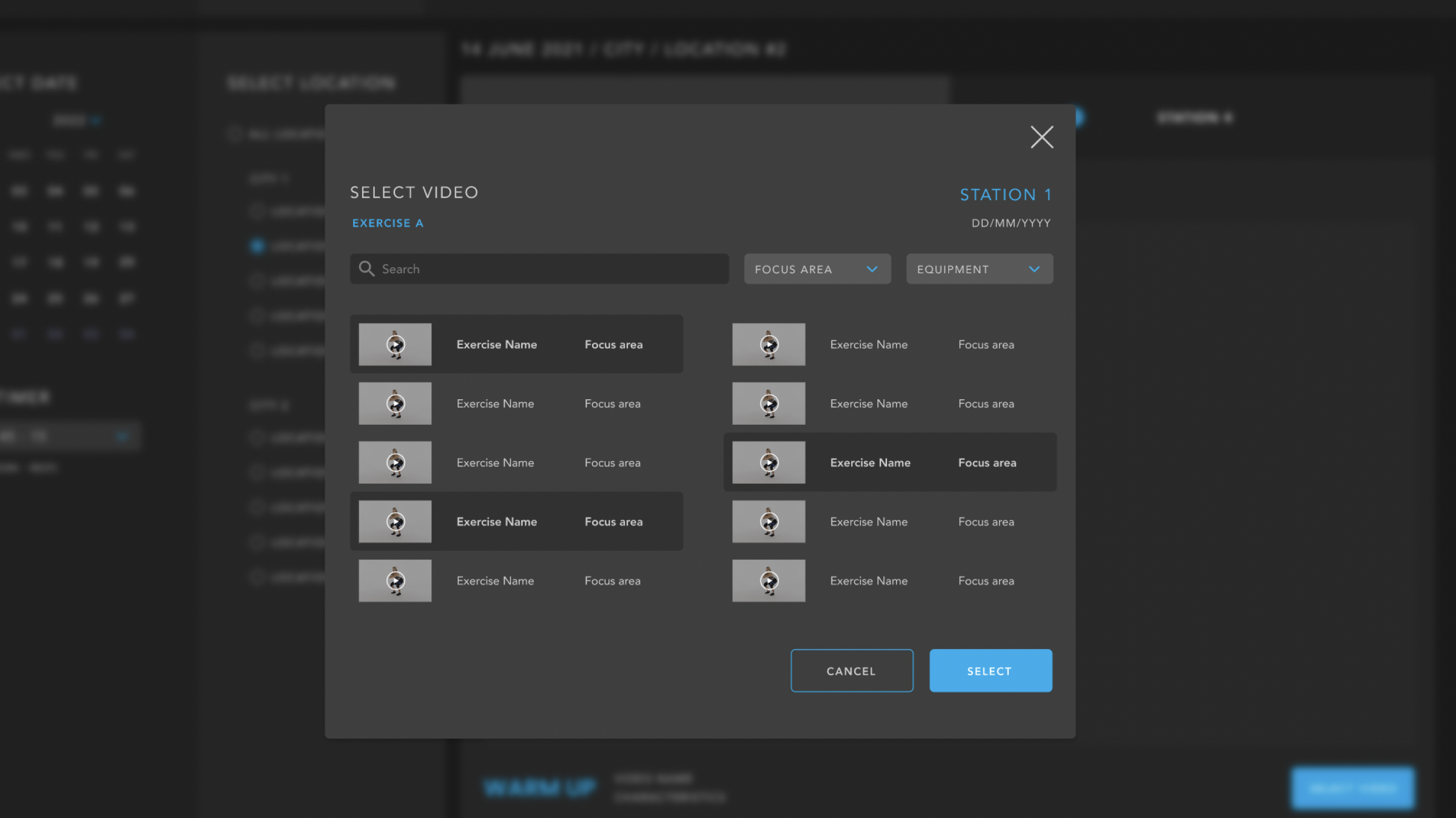
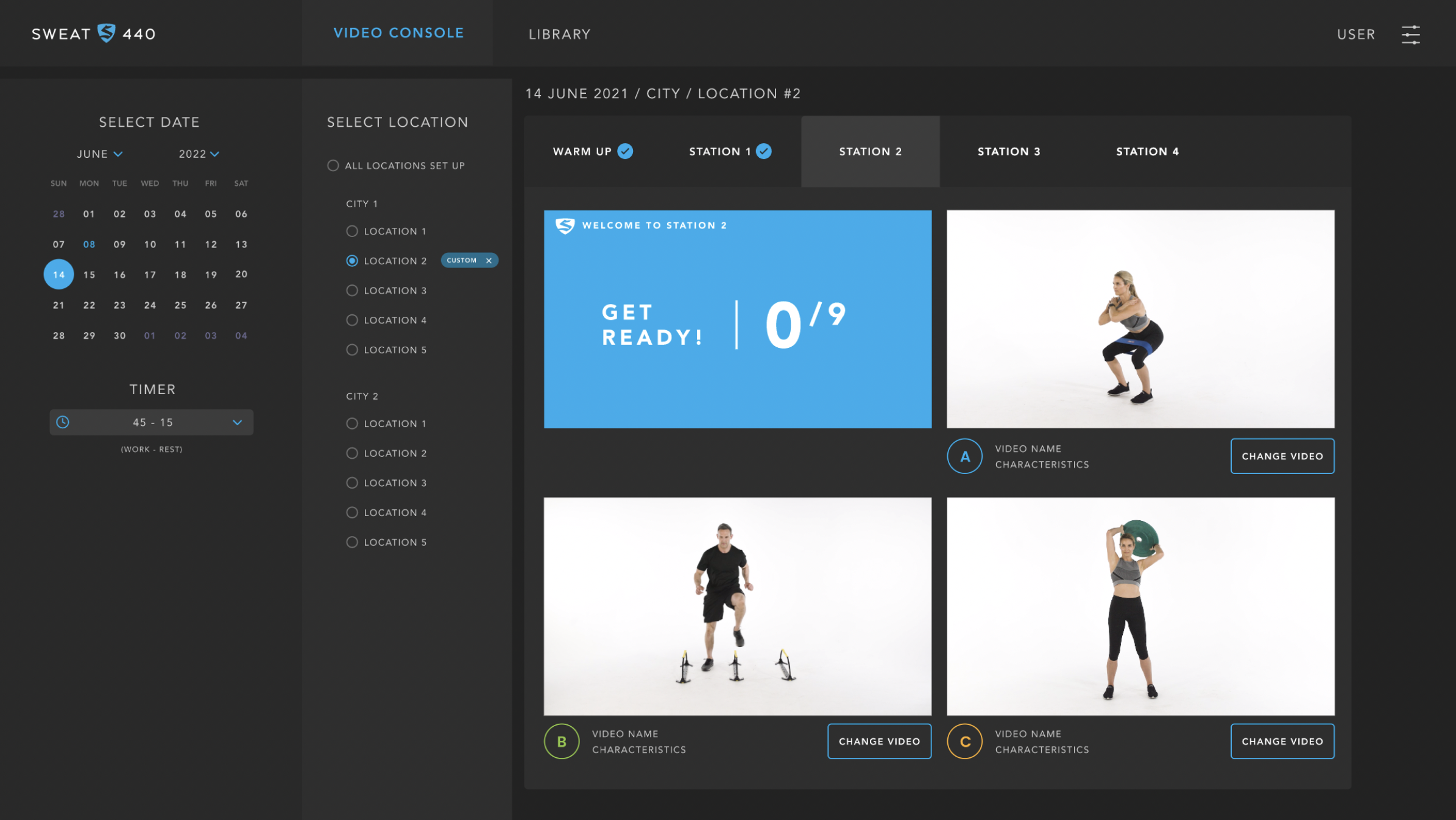
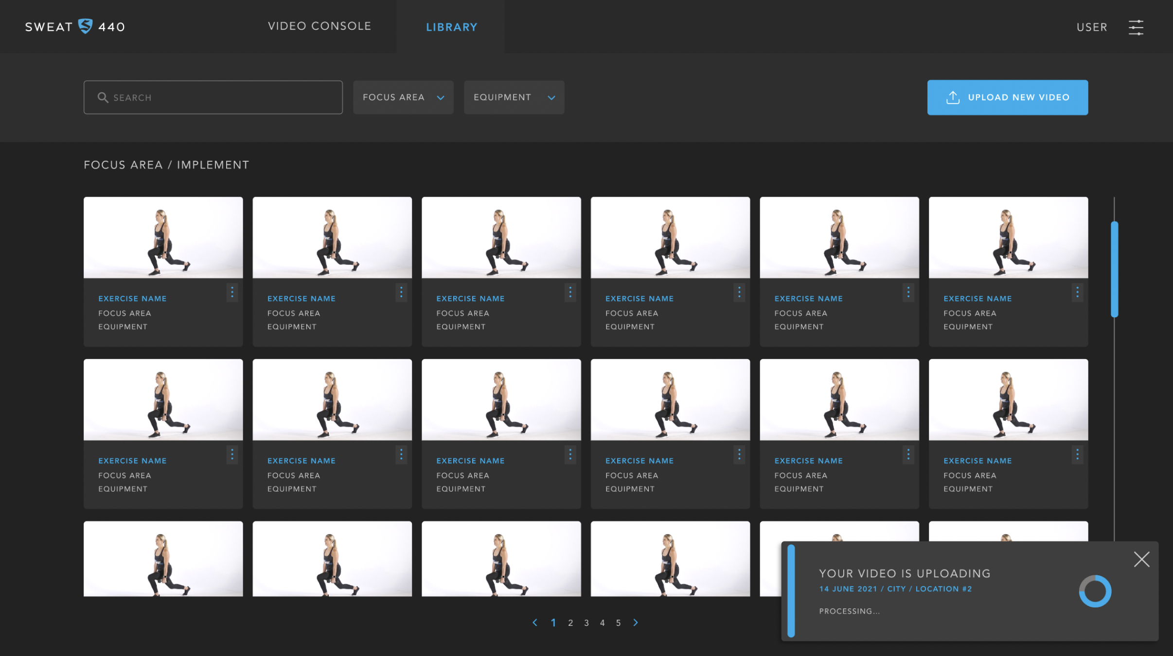
3. Created the admin configuration console
Built an intuitive backend tool to:
Configure interval timing with drag-and-drop controls
Preview the sequence before publishing
Reduce setup steps by consolidating controls into a single panel
4. Built interactive prototypes
Produced Figma prototypes simulating:
Timing transitions
video progression
Rest period countdowns
Drag-and-drop setup for trainers
5. Conducted usability tests with trainers and athletes
Measured:
Ease of following workout cues
Clarity of transitions
Admin setup time
Error frequency
Ability to preview the workout flow successfully
Adjusted UI hierarchy and layout based on test insights.
User Persona
Userflow
Timeline
Wireframes
Monitor Display
Dashboard
User Interface High Fidelity
Result
The redesign delivered significant improvements across both user groups:
For athletes (users):
Clear, distraction-free workout guidance, improving comprehension during fast sequences.
Increased exercise follow-through thanks to better visual cues and upcoming-exercise previews.
Higher workout satisfaction, especially in high-intensity intervals.
For trainers (admins):
50% reduction in setup time because the new console consolidated controls.
Fewer errors in video selection and timing configuration.
More consistent workout experiences across locations due to standardized UI and flow.
Faster onboarding for new trainers because the interface was intuitive and preview-friendly.
For the business:
Smoother class operations
Reduced instructor frustration
More polished and professional member experience
A scalable system for future workouts and studios
Dashboard
Key Deliverables
Workout guidance UI
Exercise timing logic mapping
Admin video/timing console design
Drag-and-drop sequence builder
Interactive prototypes (user + admin)
Usability testing with trainers and members
Conclusion
By redesigning both the workout guidance screen and the internal configuration console, I delivered a more intuitive, efficient, and scalable system for SWEAT440. The new interfaces reduced operational errors, improved the member experience, and aligned workout delivery with a high-performance brand identity.